Wednesday, 6 April 2011

Evaluation Q4 - How did you use new media technologies in the construction and research, planning and evaluation stages?

Final Magazine Cover


This is our final magazine cover. As you can see it looks quite a lot different to the plan we had made a couple of weeks back. For starters, we now have a white background instead of black. This is because the images we took were of a brighter background and we though it wouldn't look that great if we cut out the people to put on a black background, so kept it as the white. We have managed to keep the 'Empire' logo which is very effective as it fits perfectly into the cover. The main colours we used were black, white and red as they are very effective on the cover of a magazine. They are easy to read colours and the red also fits in with the horror theme we gave to the magazine.


We made sure we included the necessary items such as dates, prices and barcodes. This is to make it a more realistic product. We included the main article about 'The Unknown' which is promoting our film, but instead of having the main image as the actors, we decided to do it of the crew behind the camera, therefore the people in the image are holding filming equipment that would be used in the actual filming.


I am really happy with how the magazine cover has turned out, at first I was a bit worried that without the black background it wouldn't fit very well, but in actual fact I think it works perfectly.

Monday, 4 April 2011

Images for Magazine Cover

Here are the images we took as possible images for our magazine cover. We took photos from various angles, including front on, from below and up above. We did this to see which would work better and give us a variety to choose from. I think they all work quite well as images but we need to take into consideration mastheads that will be put over the images, as we don't want the main photo to be covered over too much. We tried all of the ablove images on the template of our magazine cover and found that the last image worked the best so this is the one we are going to use.

Monday, 28 March 2011

Magazine cover


Today we started our magazine cover. We don't yet have an image we can use because the ones we do have are too similar to our poster image so we have decided to put in all of the headlines etc and then add in the image later on. Above is the first draft of our magazine cover, without image. I think the colours work really well together and match the horror theme of the magazine.

Monday, 21 March 2011

Final Poster!


Here is the final edit of our poster for our movie.
We have added in the reviews from movie magazines and critics to show what others thought of the movie and to advertise it well. We have also added a viral website to the bottom of the poster as marketing for the movie. It is a website where fans can post what they think is out there and upload images and videos etc.
I think the poster has a clear theme with our movie trailer because we have used an image that promotes a scary film and have used similar colouring with a black and white image and have used the same font for the title and other text. This shows how they have a running theme.


Monday, 14 March 2011

Feedback results

After looking at the feedback sheets that we got given back from the class we can put together results graphs to present the findings and see what percentage liked or didn't like our trailer etc.
Here are the results:


As you can see, the majority of the feedback is positive and 100% said they liked it and they could tell what genre the movie was which is very important as most of our research went into looking at existing examples of horror films to get it just right. I am really happy with the results, and if we were to make the trailer again, we would definitely take the comments on board because the audience was actually who we were targeting the film at anyway.

Monday, 7 March 2011

The Big screen...

Today we produced a feedback sheet consisting of 6 questions to ask our class about what they think of our trailer.
The questions were;
1. From watching the trailer, can you see what genre it is?
2. Did you like it?
3. What would you change about it?
4.Would you see it at the cinema?
5. What did you remember from the trailer? What stood out?
6. Did you understand the plot?

Once we gave everyone a feedback sheet, we played our trailer on the projector in the classroom. This gave us an idea of what it would look like on the bigger screen.

Monday, 28 February 2011

Tube advertising poster

We used a website which our lecturer showed us which meant you could upload our poster and it would embed in a video on either the side of a bus or in a tube station. We chose the tube station and below is the video which was created. This is really good to show advertising and the website is a good use of new technology.

Tube advertising poster

Teaser Poster

This is our first draft of the poster for our film. We have done a teaser poster to give you the basics of what will be on the poster. This includes the main image, the title of the film, 'coming soon' and a viral website address..
The website address at the bottom is different to the website shown in our trailer because this is a viral website where members of the public can go and upload their own thoughts on what the 'unknown' actually is. They can write on forums about the film and upload their videos explaining their own theories on what the unknown is and even their own paranormal experiences. This is a great way to get publicity for the upcoming movie and advertise it's big release.
I am really happy with the way our first draft has turned out, we need to develop this teaser poster further and add in quotes from directors or movie magazines giving it ratings etc. We will also add in the release date and hopefully try and edit the main image a bit further.

Monday, 14 February 2011

Planning for our magazine cover


This is our first plan for our movie poster. For it to be completed, we need to add in one of the images I have taken and by changing the font and font size. We will be using the same font we used in our
trailer to make it more coherent and for the two things to link together.


Here is the second plan but this time we have incorporated the font we want to use for the title. Already it looks a lot stronger because the genre is coming through solely on the font.
We just need to add in the image to the poster and we might have to add in some more text.


Sunday, 13 February 2011

Images for poster (unedited)


Here are the best photographs out of the shoot I did for an image for the poster of our movie. These are the un-edited versions of the photographs and next we need to edit them on photoshop to make it into black and white and enhance certain areas as well as add it titles etc.

Monday, 31 January 2011

Feedback on our trailer so far...


After uploading our trailer a week ago to YouTube and to our Blogger page, we have received a few comments already telling us what the like and think we could have done better.

Here are the comments...


Above is a screen shot from my facebook page in which I put a link to our trailer on and asked people to comment on it. We had two comments back both with positive comments. They both said it would be a film they would want to see and said that it was very atmospheric.


Monday, 24 January 2011

Uploading our trailer to YouTube

Today we watched our trailer through again and showed our lecturer again to check that everything was right and there were no more tweaks hat had to be made. Everything was how we wanted and our lecturer was really happy with the trailer we went ahead and uploaded it to YouTube.
We first had to create an account on YouTube, which was easy enough, and then from iMovie we uploaded it to YouTube from the 'share' toolbar. This is a screen shot to show our trailer on YouTube.


The next step is to share the YouTube link on our Facebook pages and share the link to our blog to get comments from other people. This is to get feedback from other people to see what they like about it and what they don't like about it. Doing this, it will help us with writing our evaluation because we can talk about about what we would change if we were to do it again.

Below is a screen shot showing that I have posted a link on Twitter to try and get people to check out our trailer on YouTube. Hopefully people will see this and comment on it.


A2 Media Horror Trailer - The Finished product

Monday, 17 January 2011

Precision editing


Today we finished editing the sound. We found a clip on www.freesound.org of footsteps on gravel which we thought would sound good for the clip of the padlock on the door.
Once we thought that our trailer was nearly there we asked our lecturer to watch it through and give us his thoughts. He said that we needed to add in a fade to black transition before the first text clip and another before the second text clip. He thought this would make it look more coherent and run smoother. He also thought that the ambient music we had used throughout was effective and thought we should use that same sound on a bit of the clip towards the end, as there was no music at this point.
We also managed to change the font for the title of our film in the trailer to the font we downloaded. Originally we couldn't get this to work on the iMovie software but our teacher found a way to help us out. We now have a signature font for our movie which can be used on the movie poster as well. This is a screen shot to show the font we have used in the editor of the iMovie software.


Once we made the changes our lecturer suggested we watched it through again and it seemed to run a lot smoother and we are all really pleased with it, including our teacher.
Our next step is to upload it to YouTube and Facebook and get feedback from people on; what they think could be changed, what they like about it and whether they would go and see the film or not. We can also start work on the movie poster and magazine cover to go with the trailer.

Friday, 14 January 2011

Editing sound for our trailer


We have been looking at the sound for our trailer because the actual sound that was recorded isn't all suitable for the trailer as there is talking and laughs which wouldn't fit the narrative and doesn't look professional.
We went onto a free download site (www.freesound.org) for music and found a scary ambient noise that sounded good for the when the camera pans around the forest and the clips which show text. It gives the clip an eery feel. We also added in an owl noise to the forest scene as it again gives the feel of a deserted place.
We found a couple of screams which we wanted to put over the last clip of the trailer when you see the people running away as the scream that was recorded wasn't very realistic. However, the scream is of only one person so we had to try and overlap the same clip twice to make it sound like more than one person is screaming.
We just need to add in some sound for the credits so the audience knows straight away that the trailer is going to be a horror.

This is a screenshot of the editing process in iMovie, showing the sound clips we have uploaded to scenes in the trailer.


Monday, 13 December 2010

Magazine cover research


For our other tasks, we have to produce a movie poster and a magazine cover to go alongside our trailer. I have already researched movie posters and our group are happy with the idea of using a similar style to the 'Blair With Project' poster and use a part of a face to show fear and anxiety. Now I need to research magazine covers which advertise scary films or even films of other genres just to see generally what the style is like and if it relates much with the actually narrative and plot of the movie they are in.


The poster on the left is of the two main characters in 'Paranormal Activity' appearing in the American magazine 'Entertainment weekly'. I think the image of the two relates to the narrative of the film because it shows them in a bed looking scared and worried. The majority of the film is filmed in the bedroom and the it is a scary film because they get haunted by a paranormal presence. Therefore, the magazine cover goes well and relates with the movie.


Although, 'Batman: The Dark Knight' is not really classed as a horror film, I think this magazine cover is a really good example of an image that relates to the film. Heath Ledger is dressed in the same outfit that he wears in the film and is in character which makes you relate to the film and our knowledge of the film. The look on his face realtes to the character he plays as well and advertises the film well. It would have a very different effect if it was just an image of Heath Ledger dressed normally, posing for a normal shoot.


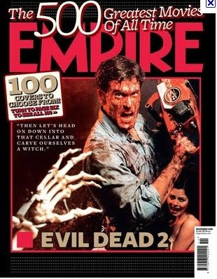
Here is another example of an Empire magazine cover and I managed to find one with a horror film advertised on the front. Although the horror film is not the same genre as ours and is quite an old film, it still shows us how the front cover is set out and how the image advertises the film as if the image is a still from the movie.
The image has a lot of red in it which has connotations of danger and evil, which signifies to the audience that this is a horror film. For our movie, I think darker colours with a green tint would suit better for our paranormal effect.
For our magazine cover which advertises our film, we need to have an image that connects with both the trailer and the movie poster, otherwise there will be no connection from the audience to the the trailer.

Movie poster research


We have started to look at horror movie posters and magazine covers today because we need to produce one of each ourselves for our film. Doing this research will help us decide what sort of image we would like as our movie poster and also what kind of image would be appropriate for a magazine cover.

On the left is the movie poster for 'The Blair Witch Project' which is probably the nearest thing to our own movie trailer. As you can see it shows a close-up shot of one of the characters looking scared with tears in her eyes. This fits in with their movie because it is all hand held camera so therefore this shot which looks like it has been taken by herself fits.


This is another version of the movie poster for 'The Blair Witch Project'. Although it's different, it is still very effective because it is in a black and white style which looks like an x-ray. Also it is a shot from the ground looking up, which makes everything seems huge and exaggerated. This sort of shot could be good for our movie poster because our end shot of our trailer is a shot from the ground, therefore would tie in with what we have already don


e in our trailer.


On the left is the movie poster for 'Paranormal Activity' which I have looked at quite in depth for my research on existing horror movies. Again, I think the poster is quite effective because it is edited in a way to make it look like CCTV which makes it a bit mysterious and fits with the films narrative and plot because they set up a camera to film their room like a CCTV camera.


I think having people's comments about the film at the top of the poster works well because it makes you want to see it if everyone is praising it. I also think the red and white writing work well against the black background. The colour red has connotations of danger, evil and horror so it definately works with the genre.


On the right is the poster for the film 'Mirrors'. Again, it has used a face which I think is really effective because like I said earlier, it shows emotion and automatically connects with the audience that it is a horror film. Normally, other factors come into the connection with the audience about the genre of the film such as the title etc, however I don't think 'Mirrors' automatically make you think of a scary film. Therefore using the image of the face works really well alongside the title to create the scare factor.


At the moment I really like the first 'Blair Witch Project' poster with the face on it. I think it is simple yet really effective and works well with our movie trailer because its believable and looks realistic. Our trailer is shot using a hand held camera and is supposed to be a sort of documentation of the girls journey that has been found. I also think that using a face, you can show emotion really well which connects with the audience. Using an image of one of the girls in a similar style to the 'Blair Witch Project' poster, would work well and go really well with our trailer.