Monday 13 December 2010

Magazine cover research


For our other tasks, we have to produce a movie poster and a magazine cover to go alongside our trailer. I have already researched movie posters and our group are happy with the idea of using a similar style to the 'Blair With Project' poster and use a part of a face to show fear and anxiety. Now I need to research magazine covers which advertise scary films or even films of other genres just to see generally what the style is like and if it relates much with the actually narrative and plot of the movie they are in.


The poster on the left is of the two main characters in 'Paranormal Activity' appearing in the American magazine 'Entertainment weekly'. I think the image of the two relates to the narrative of the film because it shows them in a bed looking scared and worried. The majority of the film is filmed in the bedroom and the it is a scary film because they get haunted by a paranormal presence. Therefore, the magazine cover goes well and relates with the movie.


Although, 'Batman: The Dark Knight' is not really classed as a horror film, I think this magazine cover is a really good example of an image that relates to the film. Heath Ledger is dressed in the same outfit that he wears in the film and is in character which makes you relate to the film and our knowledge of the film. The look on his face realtes to the character he plays as well and advertises the film well. It would have a very different effect if it was just an image of Heath Ledger dressed normally, posing for a normal shoot.


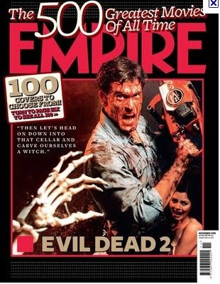
Here is another example of an Empire magazine cover and I managed to find one with a horror film advertised on the front. Although the horror film is not the same genre as ours and is quite an old film, it still shows us how the front cover is set out and how the image advertises the film as if the image is a still from the movie.
The image has a lot of red in it which has connotations of danger and evil, which signifies to the audience that this is a horror film. For our movie, I think darker colours with a green tint would suit better for our paranormal effect.
For our magazine cover which advertises our film, we need to have an image that connects with both the trailer and the movie poster, otherwise there will be no connection from the audience to the the trailer.

Movie poster research


We have started to look at horror movie posters and magazine covers today because we need to produce one of each ourselves for our film. Doing this research will help us decide what sort of image we would like as our movie poster and also what kind of image would be appropriate for a magazine cover.

On the left is the movie poster for 'The Blair Witch Project' which is probably the nearest thing to our own movie trailer. As you can see it shows a close-up shot of one of the characters looking scared with tears in her eyes. This fits in with their movie because it is all hand held camera so therefore this shot which looks like it has been taken by herself fits.


This is another version of the movie poster for 'The Blair Witch Project'. Although it's different, it is still very effective because it is in a black and white style which looks like an x-ray. Also it is a shot from the ground looking up, which makes everything seems huge and exaggerated. This sort of shot could be good for our movie poster because our end shot of our trailer is a shot from the ground, therefore would tie in with what we have already don


e in our trailer.


On the left is the movie poster for 'Paranormal Activity' which I have looked at quite in depth for my research on existing horror movies. Again, I think the poster is quite effective because it is edited in a way to make it look like CCTV which makes it a bit mysterious and fits with the films narrative and plot because they set up a camera to film their room like a CCTV camera.


I think having people's comments about the film at the top of the poster works well because it makes you want to see it if everyone is praising it. I also think the red and white writing work well against the black background. The colour red has connotations of danger, evil and horror so it definately works with the genre.


On the right is the poster for the film 'Mirrors'. Again, it has used a face which I think is really effective because like I said earlier, it shows emotion and automatically connects with the audience that it is a horror film. Normally, other factors come into the connection with the audience about the genre of the film such as the title etc, however I don't think 'Mirrors' automatically make you think of a scary film. Therefore using the image of the face works really well alongside the title to create the scare factor.


At the moment I really like the first 'Blair Witch Project' poster with the face on it. I think it is simple yet really effective and works well with our movie trailer because its believable and looks realistic. Our trailer is shot using a hand held camera and is supposed to be a sort of documentation of the girls journey that has been found. I also think that using a face, you can show emotion really well which connects with the audience. Using an image of one of the girls in a similar style to the 'Blair Witch Project' poster, would work well and go really well with our trailer.


Monday 6 December 2010

Editing continued...


Today we continued to edit our footage. It is coming along really well and my group and I are so happy with what we have achieved so far.
We managed to get an image from the internet which is the movie certificate title that appears at the beginning of most trailers. We found a 'rated R' which was really lucky because it suits our movie as it means resstricted and our film is scary and would therefore be restricted viewing.
On the left is an example of the image we used.


We also put the 'Lionsgate' image after this age certificate title to make our trailer look more realstic as if a film company had made the film. We chose 'Liongate' because they have made films such the 'Saw' movies and 'The Last Exorcism'. These films fit our genre so therefore we thought Lionsgate would be an appropriate film company to use. There was a red version of this 'Lionsgate' logo but we chose to use the grey and white coloured version because it fitted the look of our trailer as we had used greyish and dim colours.
We have all the footage we need and in total so far our trailer equals about 1 minute 15 seconds which is perfect because the trailer is meant to be between a minute and a minute and a half. This time included title sequences, the age restriction and Lionsgate titles and a 'coming soon' title clip at the end.
Today we started to put in transitions and played around the speed of some of the clips. We slowed down the clip of the lock on the door and the clip of one of the actresses looking worried. We thought this would make it seem more tense and eery. Without doing the music yet, we showed our lecturer to see what he thought of what we had done so far and whether he thought it flowed nicely. Once we had showed him, our lecturer said he didn't think the slowed down parts worked very well because they were a bit too slow. He also said that we needed to add in a few more transitions because it cuts from a well lit scene to a very dark scene with no transition so it didn't look very professional. Taking these comments on board, we added in some transitions and changed the speed back so it wasn't as fast as it was originally but wasn't as slow as we had changed it to first. It is looking a lot better.
We started looking at the sound clips that were already on the iMovie software to see if it offered anything that would suit our trailer. We managed to find an ambient noise which sounded a bit sinister and eery. We have used this sound clip over our text slides during the trailer.
Our next step is to add in more music and take out any of the unwanted noises such as talking in the background. We need to find more dramatic music to use during the main body of the trailer to build suspense and attract the audience. We also want to find a scream noise to put over the 'coming soon' title at the end to finish the trailer off nicely.